Your homepage is often the first page a user visits on your site. It should convey information about your department and the purpose of the website and provide easy access to the most important pages on the site via links, buttons, or Image Callouts.
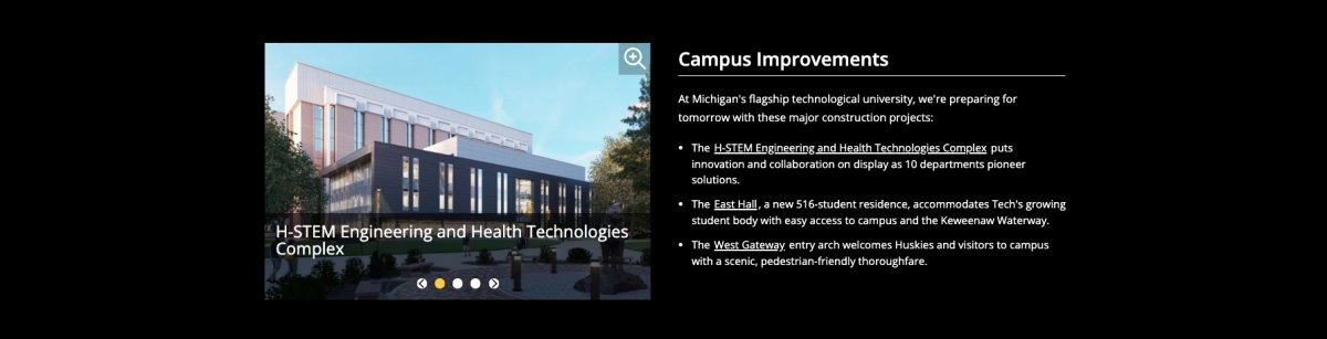
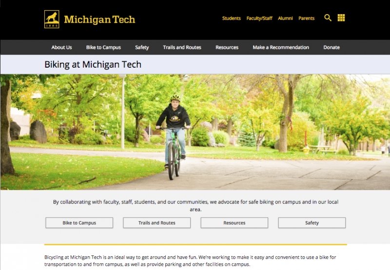
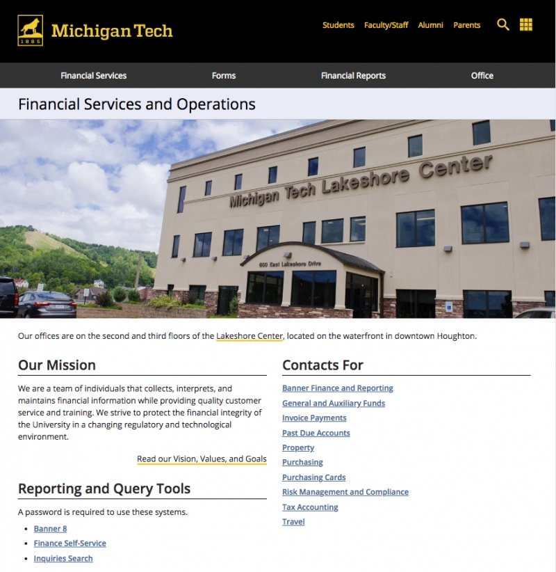
Banner Image
The Banner image is the image at the top of the page above almost all content. This image is not required for administrative websites. On a homepage you should only use the Hero or Feature options.
- Turn on the image in the Page Image Location Options with the Page Parameters.
- Use the Image Editor to create the appropriate size image based on the selection you made.
- Insert the image and set additional Banner Image options in MultiEdit Content.
Intro Content
If you include a Hero image you can choose to use the Intro Content Editable Region to include a highlighted summary statement about the department just below the image. This region is also a good place to include a row of buttons linking to important pages on your site.
Left Sidebar
You must turn off the left sidebar on your homepage by unchecking the box in Page Parameters.
Right Sidebar
Homepages generally do not use right sidebars, however there are some instances when it could be used to provide supplemental information. Turn on the Right Sidebar Editable Region using the checkbox in Page Parameters.
Main Content
Providing links to important pages from your homepage is important, especially for mobile users. This can be done in several ways.
Row of Buttons
We recommend 1-5 rollover buttons in a row.
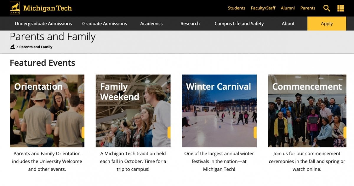
Card
We recommend 2-5 Card shortcuts in a row. You can include multiple rows.
Link List
You can create a list of links using the heading and bulleted list options in the Editor toolbar. To remove the bullets and indentation, add a class of "none" to the <ul>.
Additional Content Area Sections
You can create separate sections in the Additional Content Area that highlights a specific piece of content such as a giving section, a call to action, special programs, or an important event. These are full-width sections that use Boxed Section Snippet within a Row with Background Snippet creating a colored background which really makes the content stand out. To name a few, you can create separate sections for:
- Touts
- Quotes (quotes with video)
- Giving
- Department mission/priorities
- Benefits of a program
- FAQs