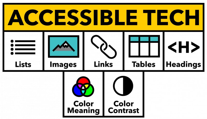
Tables
Introduction
Tables are used extensively within instructional materials to organize information, summarize key concepts, and support student learning. Whether you're presenting research data, comparing ideas or texts, outlining processes or timelines, or structuring assessment criteria, tables help students see relationships and patterns in course content. Instructors frequently include tables in Canvas pages, Word or Google Docs, PDFs, and slide decks as a clear and efficient way to present information. Accessible tables allow all students, including those who use assistive technology, to independently navigate and understand the table information.
Best practices for accessible tables:
- Include programmatic table headers. These are cells that describe the data contained in their column or row.
- Contain data (not used for layout purposes). Data tables are used to arrange tabular data, while layout tables are used to arrange the layout of your document.
- Include a table caption (recommended) that describes the table's content.
- Avoid merged cells and empty data cells when possible.
Headers
Programmatic table headers identify what the data in each row or column represents. A column header describes the data beneath it, while a row header describes the data across it. These headers act as orientation markers, helping readers quickly understand how information is organized and how individual data points relate to the larger table.
For students using screen readers or other assistive technologies, programmatic headers are essential. As users move through a table, the headers are announced so they always know which row and column they are in. Without this structure, tables become difficult to interpret and navigate. If a table spans multiple pages, repeating headers helps all readers maintain context and reduces confusion.
Table captions
Tables should include enough context so readers immediately understand what information they contain. This can be provided through a clear table caption—such as “Table 2: Weekly Lab Measurement Results”—or by introducing the table in nearby text, for example: “The following table summarizes student quiz scores across the semester.” Either approach helps orient readers before they begin interpreting the data.
Providing this context supports all learners by clarifying the purpose and scope of the table. A well-written caption or introduction reduces guesswork, improves comprehension, and ensures that students using assistive technologies receive the same meaningful overview as sighted readers.
Data tables versus presentation tables
Tables should be used to present structured data—not for visual layout. A data table organizes information into rows and columns so readers can compare values and understand relationships, such as assignment scores or lab results. In contrast, a layout table is used only to control visual placement, like arranging images or text in a grid, and does not represent true tabular data.
Using tables purely for layout can create confusion for screen reader users because assistive technologies expect tables to contain meaningful data relationships. Instead, use built-in layout or formatting tools to control visual design, and reserve tables for presenting information that benefits from a clear row-and-column structure.
Merged table cells
Merged table cells combine multiple rows or columns into a single larger cell. While this can improve visual appearance, many common editing tools—such as those used to build Canvas pages or create documents in Word or Google Docs—do not reliably support the accessibility structure needed to communicate these relationships to screen readers.
When merged cells lack proper structure, assistive technologies may read the table in a confusing order, making it difficult for students to follow the data. To reduce navigation issues, keep tables as simple as possible and limit merged cells to situations where they are truly necessary.
Empty table cells
Avoid leaving empty cells in data tables. Screen readers may interpret blank cells as the end of a row or table, which can cause students to miss information. If no data applies, include a clear placeholder such as “0” or “Not applicable” so readers understand the cell is intentionally empty. One common exception is the top-left corner cell when a table includes both row and column headers. Leaving that cell blank is acceptable because it serves as a structural intersection rather than a data point.
Inserting a table in Canvas
Follow the steps below to create a table, add a caption and specify header rows and/or columns as needed:
-
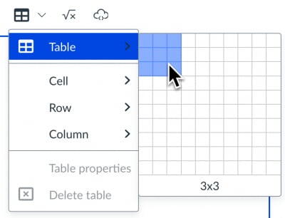
Select the table icon in the rich content editor
-
Hover over the table option in the menu and specify the table dimensions by dragging your cursor over the table grid.
-
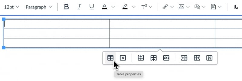
After inserting the table click on it in the rich content editor to access the table context menu. This menu provides options for accessing the table properties, deleting the table, and adding and deleting rows.
-
Choose the table properties option. You can also access table properties from the table icon in the rich content editor toolbar.
-
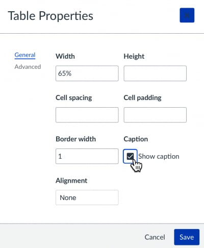
Check the “show caption” box to enable this feature.
-
You can optionally specify the width, height and other parameters of the table if needed.
-
Click the save button to update the table. You will see a caption text field above the table for you to enter a table caption.
Adding header rows and columns in a Canvas table
When creating an accessible data table it’s important to designate column and/or row headers. The example table has a header row functioning as column headers. The scope table property specifies whether a table header is a column header or a row header.
To add this functionality to the table:
-
Open the rich content editor and select the table.
-
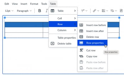
Select all cells in the first row of the table.
-
Select Row>Row Properties from the table icon menu in the rich content editor.
-
Select the Header option from the row type menu.
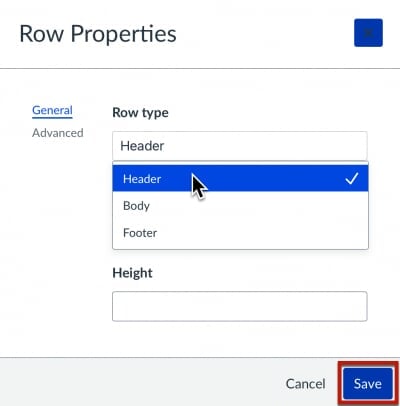
-
Click the save button to update the table.
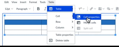
-
With all first row cells still selected, select Cell>Cell Properties from the table icon menu in the rich text editor.
-
Confirm Header cell is selected in the Cell Type menu.
-
Choose Column from the Scope menu.
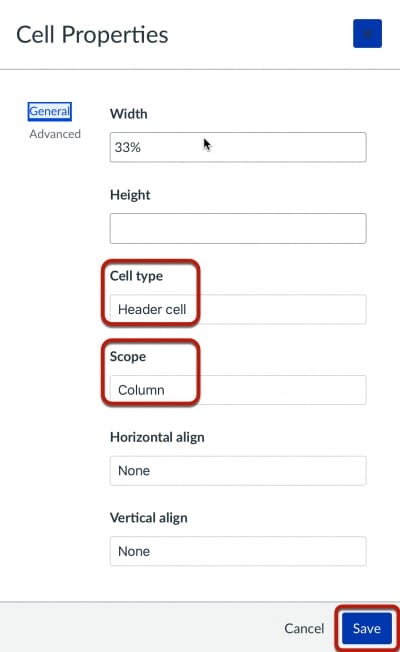
-
Click the save button to update the table.
Inserting a table in Microsoft Word
Inserting a table in Word and adding table headers
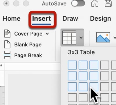
-
Choose Insert > Table. Specify the table dimensions by dragging your cursor over the table grid. When you add a table to your document, two new tabs appear in the ribbon: Design and Layout. These are the Table Tools.
-
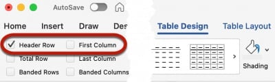
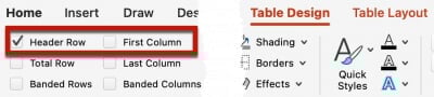
From the Table Design tab check the Header Row option in the upper left corner of the window. This will mark the first row of the table as a header row.
-
If your table also uses row headers check the First Column option.
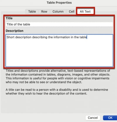
Adding a table title and description
Tables should have a title and description available for users of assistive technology.
Follow the steps below to add this information to your tables in Word:
-
With the table selected, right-click and select Table Properties.
-
Choose the Alt Text tab and enter a title and short description of the table information. This information will be available to assistive technology users.
Inserting a table in Microsoft PowerPoint
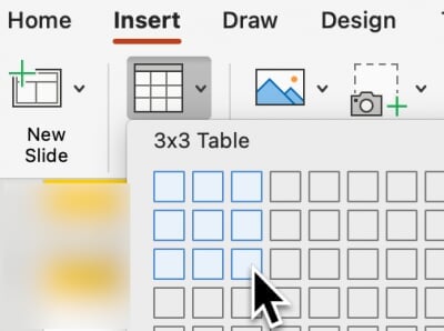
Avoid using complex tables in presentations slides. If simple tables are needed follow these steps:
- Choose Insert > Table. Specify the table dimensions by dragging your cursor over the table grid. When
you add a table to your presentation slide, two new tabs appear in the ribbon: Design and Layout. These are the Table Tools.
- From the Table Design tab check the Header Row option in the upper left corner of the window. This will mark the first row of the
table as a header row. If your table also uses row headers check the First Column option.
Inserting a table in Google Docs
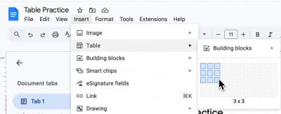
- Choose Insert > Table. Specify the table dimensions by dragging your cursor over the table grid. The table
will be inserted at the cursor location.
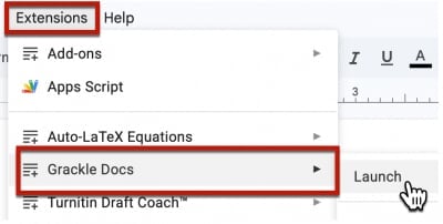
Note: It is currently not possible to specify header rows or columns directly in Google Docs. We recommend you use Grackle Docs to add this information to your document. All Michigan Tech staff, faculty and students can install the Grackle Docs extension to their MTU account for free. Review this knowledge base article for details. Alternatively you can download your Google Doc in Word format and add the table header information using Word.
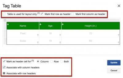
Inserting table headers with Grackle Docs
- To add table headers in a Google Doc, launch the Grackle Docs extension.
- Locate the table section of Grackle extension at the right of the document. Click
"locate" to navigate to the table in the document, then click "Tag" to access the
Grackle Docs table editor.
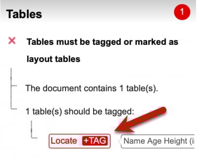
- Select the appropriate header row or column options for your table and save your changes
by clicking the Update button.
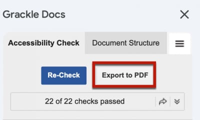
- If you require an accessible PDF of the Google Document, use the Export PDF option from the top of the Grackle Docs interface. Note: Downloading a PDF file from the Google Doc File menu will not include the accessible table tags reviewed here.
Resources
- Create accessible tables in Canvas
- Insert a table in the Canvas rich content editor
- Create accessible table in HTML (WebAIM resource)
- Create accessible tables in Word
- Create accessible tables in PowerPoint (WebAIM resource)
- Make PowerPoint Accessible (Microsoft resource)
- Add and edit tables in Google Docs
- Make accessible tables in Grackle Docs
- Complex tables (setting scope for merged cells) in Adobe Acrobat Pro
- Accessibility best practices with Excel spreadsheets