Introduction
Thoughtful use of color can improve a Canvas page, document or slide presentation, but accessibility depends on both sufficient contrast and not relying on color alone to communicate meaning.
Color to Convey Meaning
Color can be a helpful design tool, but it should never be the only way you communicate meaning. If students must perceive color alone to understand whether something is correct, required, urgent, or incomplete, some may miss that message entirely. This can affect people who are blind, have color vision deficiency, use screen readers, or view content in grayscale or under poor lighting conditions. Accessibility guidance therefore recommends that color be used to support meaning, not convey it by itself.
A more comprehensive approach is to pair color with another cue, such as text, an icon, a pattern, a label, or a symbol. For example, instead of showing correct answers only in green, label them with a word such as "Correct" or add a checkmark icon.
In a chart or table, do not rely on green, yellow, and red alone to communicate status;
include text labels such as "Passed, "Review," or "Errors". 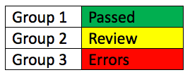 This helps ensure that all students can identify the meaning, regardless of how they
perceive color. Using more than one cue also improves clarity for everyone, not just
users with disabilities, because it reduces guesswork and makes content easier to
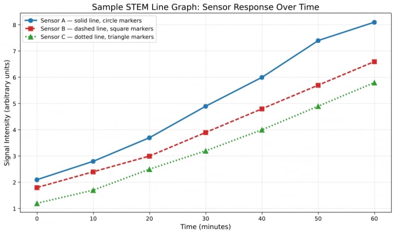
interpret quickly. In the graph below, each data series is identified through both
color and non-color cues, including line pattern and marker shape, making the chart
easier to interpret for a wider range of users.
This helps ensure that all students can identify the meaning, regardless of how they
perceive color. Using more than one cue also improves clarity for everyone, not just
users with disabilities, because it reduces guesswork and makes content easier to
interpret quickly. In the graph below, each data series is identified through both
color and non-color cues, including line pattern and marker shape, making the chart
easier to interpret for a wider range of users.
Resources
- Making Color Usage Accessible (U.S. General Services Administration resource)
- Potential Use of Color Alone to Communicate Information (CidiLabs ULEARN resource)
- Understanding Use of Color WebAIM resource
- Use of Color (W3C-Web Accessibility Initiative resource)
Color Contrast
Color contrast refers to the difference in brightness between text or other important visual elements and the background behind them. Strong contrast makes content easier to read and scan, while weak contrast can make text difficult or even impossible for some people to perceive. This is especially important for people with low vision, reduced contrast sensitivity, or certain types of color vision deficiency. Good contrast also benefits many other users, including those reading on mobile devices, in bright light, or when experiencing eye strain.
When creating instructional materials, aim to use text and background combinations that are easy to distinguish at a glance. In many cases, dark text on a light background is the simplest and most readable choice. If you choose other colors, it is important to verify that they still provide sufficient contrast. For normal-sized text, the web content accessibility guidlines (WCAG) call for a contrast ratio of at least 4.5:1. Large text can meet a slightly lower threshold, but using strong contrast consistently is often the easiest and most reliable practice.
- A very good contrast ratio (foreground text=black, background=white, ratio=21:1)
- A satisfactory contrast ratio (foreground text=#6C6C83, background=white, ratio=5.1:1)
- A failing contrast ratio (foreground text=#A6A6A6, background=white, ratio=2.4:1)
Contrast checkers can help you test contrast on text, hyperlinks, buttons, icons, and other visual elements before sharing materials with students. Review the resource links below for free contrast checkers you can use.
Resources
- Understanding Color Contrast WebAIM rersource
- Understanding Contrast(W3C-Web Accessibility Initiative resource)
- Free contrast checkers:
Using Color in Canvas
Canvas can help you identify low contrast text. Take a look at the accessibility checker
icon at the bottom of the Rich Content Editor in Canvas. 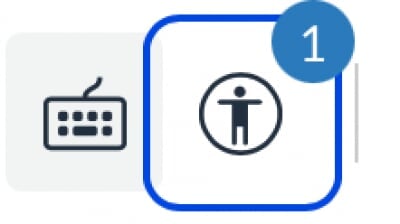 If there is a number by it, Canvas has identified a possible accessibility error
on the page. Click the icon to investigate further.
If there is a number by it, Canvas has identified a possible accessibility error
on the page. Click the icon to investigate further.
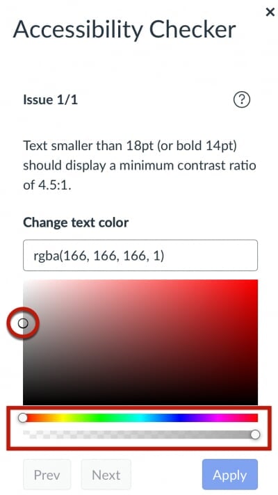
To fix low color contrast using the Canvas Accessibility Checker, change the color of the low contrast text by sliding one of the sliders in the Accessibility Checker or moving the dot until the Apply button is active. Click Apply to save your changes.
Using Color in Word
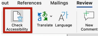
The Word Accessibility Assistant can identify color and contrast errors in documents. From the Review tab in the ribbon select the Check Accessibility tool to open the assistant.
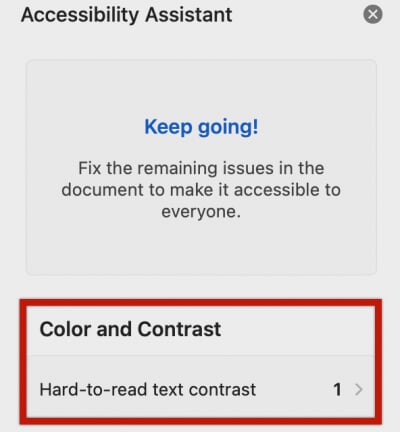
If it detects errors, you will see a number listed in the Color and Contrast section of the Accessibility Assistant to the right of the document.
Click the Hard-to-read text contrast button and the Accessibility Assistant will suggest some higher contrast colors to help you make the text easier to read. Choose one of the suggested colors or manually change the text to a higher-contrast color that you prefer.
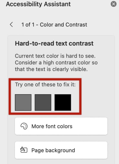
The assistant will automatically update to clear the contrast error once it is fixed.
Using Color in PowerPoint
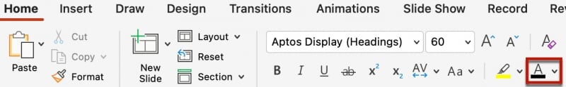
There is an also Accessibility Assistant available in PowerPoint that functions similar to the Word version. The checker should flag contrast errors for text placed on a slide, but it's also a good best practice to manually review contrast issues using one of the contrast checkers referenced earlier to confirm any contrast issues you may be unsure of. If you identify low-contrast text in your PowerPoint presentation, first, highlight the text, then click the Font Color tool in the Home ribbon near the top of the window to select a different color for the text.
Using Color in Google Docs
Google Docs does not have a native tool for identifying low-contrast text. You can use a contrast checker tool to verify contrast. To remediate low-contrast text in your document, highlight the text and change the color using the Text Color tool in the toolbar near the top of the document.
![]()
The recommended option for identifying and correct contrast issues in Google Docs is to use Grackle Docs. All Michigan Tech staff, faculty and students can install the Grackle Docs extension to their MTU account for free. Review this knowledge base article for details. Alternatively you can download your Google Doc in Word format and correct the contrast issues using Word.
Correcting contrast errors with Grackle Docs
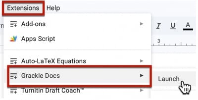
- To correct contrast errors in a Google Doc, launch the Grackle Docs extension.
- Locate the Contents section of the Grackle Docs extension at the right of the document. Color contrast
errors will appear in the item titled "High color contrast should be used".
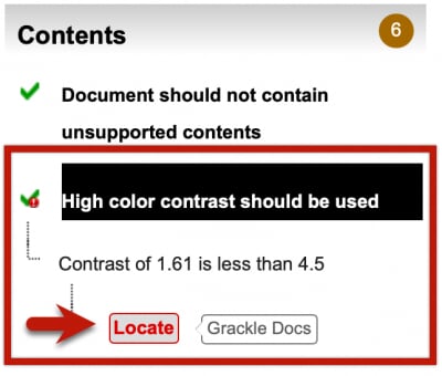
- Click "Locate" to navigate to the contrast error in the document.
- Adjust the color from the Google Doc toolbar to remove the error.
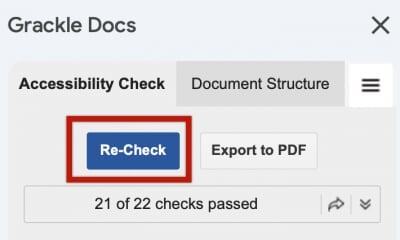
- Click the Re-Check button at the top of the Grackle Docs panel to confirm that the
contrast error has been resolved.
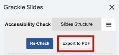
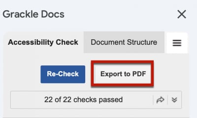
- If you require an accessible PDF of the Google Document, use the Export PDF option from the top of the Grackle Docs interface. Note: Downloading a PDF file from the Google Doc File menu will not include the accessible table tags reviewed here.
Using color in Google Slides
Google Slides does not have a native tool for identifying low-contrast text. You can use a contrast checker tool to verify contrast. To remediate low-contrast text in your slide presentation, highlight the text and change the color using the Text Color tool in the Google Slides toolbar near the top.
![]()
The recommended option for identifying and correct contrast issues in Google Slides is to use Grackle Slides. All Michigan Tech staff, faculty and students can install the Grackle Slides extension to their MTU account for free. Review this knowledge base article for details. Alternatively you can download your Google Slides presentation in PowerPoint format and correct the contrast issues using PowerPoint.
Correcting contrast errors with Grackle Slides
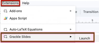
- To correct contrast errors in a Google Slides, launch the Grackle Slides extension.
-
Grackle Slides will scan your presentation for a variety of possible accessibility issues.
Locate the Contents section of the Grackle Slides extension at the right of the presentation. Color contrast errors will appear in the item titled "High color contrast should be used". Click the High Color Contrast Should Be Used item to review the color contrast errors.
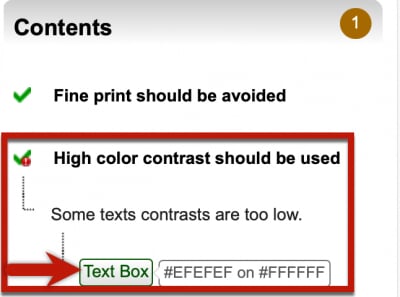
- Click "Text Box" to navigate to the contrast error in the presentation.
- Adjust the color from the Google Slide toolbar to remove the error.
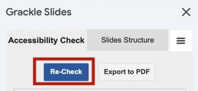
- Click the Re-Check button at the top of the Grackle Slides panel to confirm that the
contrast error has been resolved.
- If you require an accessible PDF of the Google Slides, use the Export PDF option from the top of the Grackle Docs interface. Note: Downloading a PDF file from the Google Slide File menu will not include the accessibility improvements reviewed here.