Our Logo System
The Michigan Technological University logo is a central part of our visual identity, consisting of two parts: our Husky icon and wordmark.
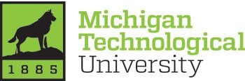
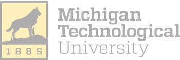
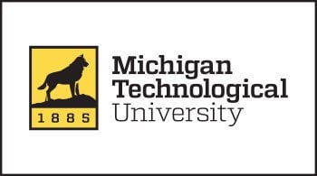
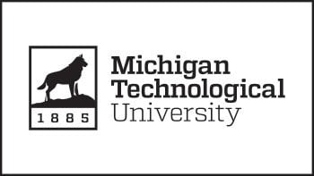
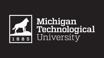
Our logos can be used in full color, single color, and inverse variations. Colors other than black, yellow, or white should never be used in our logos.
All Michigan Tech logos are registered trademarks of Michigan Technological University. The use of the Michigan Tech name, logos, seals, and/or other symbols of the University, in commercial venture, even fundraising or promotional activities, requires prior written approval. Only licensed vendors are authorized to produce merchandise and apparel featuring the University name and/or logos. For more information and a list of licensed vendors, please visit our Trademark Licensing page.
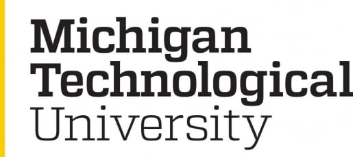
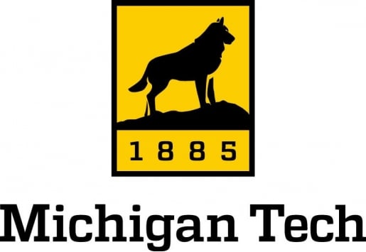
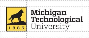
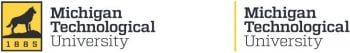
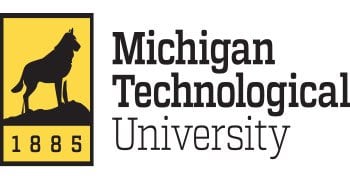
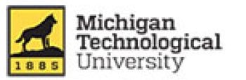
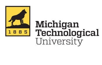
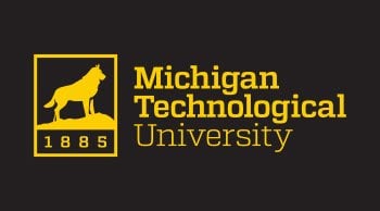
Full Name
The Full Name Horizontal or Full Name Wordmark variations should be used when you need to provide immediate identity recognition. Examples of this include any scenarios where the University brand is unfamiliar to our audience.
Full-Name Horizontal
Full-Name Wordmark Stacked
![]()
Full-Name Wordmark
Full-Name Horizontal Inverse
Full-Name Wordmark Stacked Inverse
![]()
Full-Name Wordmark Inverse
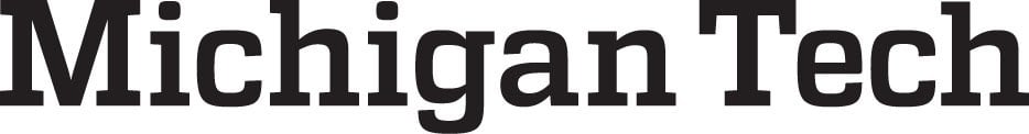
Michigan Tech
In cases where the Full Name Horizontal or Full Name Wordmark is also present, the abbreviated Michigan Tech logo may be used.
Michigan Tech Vertical
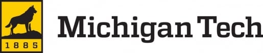
Michigan Tech Horizontal
![]()
Michigan Tech Wordmark
Michigan Tech Vertical Inverse

Michigan Tech Horizontal Inverse
![]()
Michigan Tech Wordmark Inverse
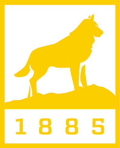
Husky Icon
The Husky Icon should only be used when the name of the University is present elsewhere. On campus, this mark may stand alone when used in conjunction with signage, events, and internal communication.
![]()
Husky Icon
-
Husky Icon Inverse -
Husky Icon Yellow
Clear Space
Clear space is the protected area around the logo that maximizes its impact. This space must be kept free of all other graphics and text, including other logos.
Maintain 0.25 inch of clear space around the logo for print and 25 pixels for web. This applies to all logo variations.
Minimum-Size Requirements
Minimum size requirements ensure legibility of the logo. Contact University Marketing and Communications with questions or concerns regarding logo size.
Our Full Name Horizontal logo variations should never be smaller than 0.5 inch tall for print or 50 pixels for web.
The Michigan Tech Wordmark should never be smaller than 1.5 inches wide for print or 150 pixels for web.
![]()
Unacceptable Applications
Do not re-create the Michigan Tech logo, change the logo's color, stretch the type, alter or move elements of the logo, or add or subtract design elements. Use only official logos prepared by and available from University Marketing and Communications.
Do not warp or stretch the logo.
Do not use another color within the logo.
Do not make the logo transparent.
Do not use a web logo for print.
Do not move elements of the logo.
![]()
Do not rotate or tilt the logo.
![]()
Do not change the logo to an off-brand color.
![]()
Do not mix the one-color logo options.
Logo Usage
These are approved logo variations when applied on color backgrounds.
Full color logo on white background.
Black logo on white background.
White logo on black background.
Gold logo on black background.

Black logo on yellow background.
Photo Backgrounds
The following are recommendations of logo use on photographs. The designer should use their best judgment when overlaying the logo. Never place the logo over people, complex images, patterns, or main focal points in the photograph.
![]()
![]()
![]()
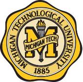
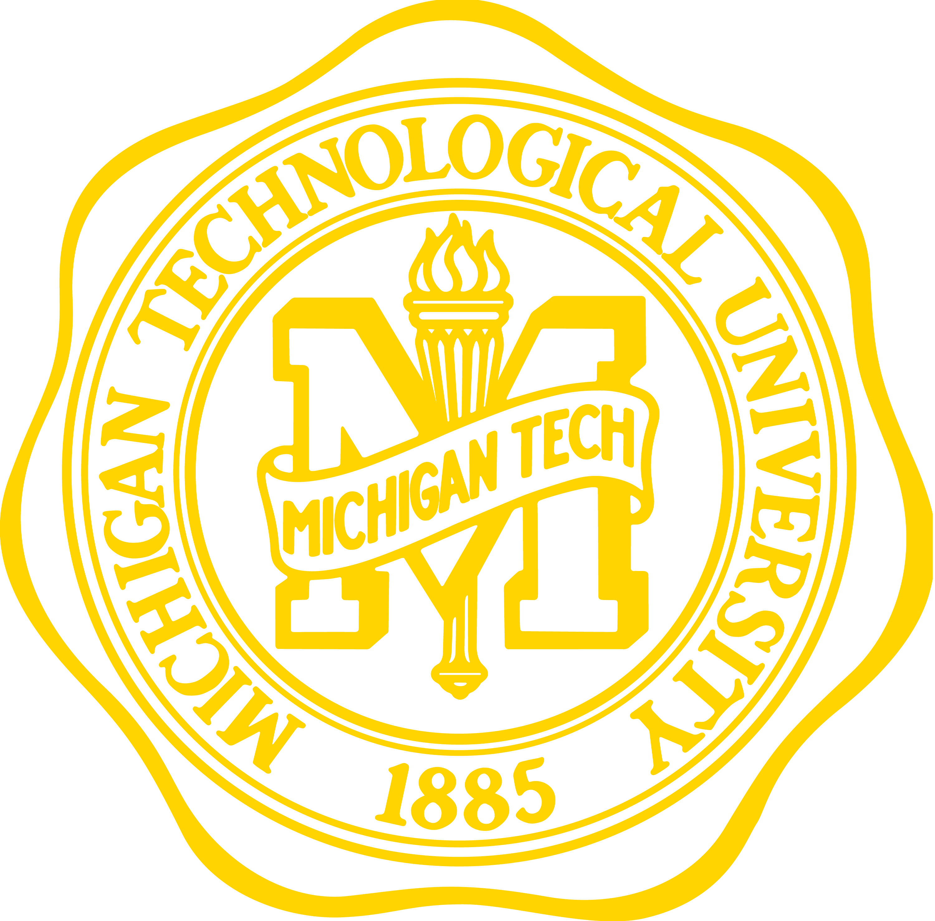
University Seal
The University seal is used for formal and official documents, such as diplomas and communications from the president. It is not for general use. The seal may not be used on apparel. The seal may not be altered in any way or blended with other designs or symbols.
The seal may be used on pre-approved specialty items.
-
University Seal Full Color -
University Seal Black
-
University Seal Inverse -
University Seal Yellow
Department Identifiers
While the University logo system is available to all Michigan Tech colleges, schools, and departments, unique identifiers are available as well. They include the department name with the University logo and name.


Download Department Identifiers
Unacceptable Applications
Do not re-create the Michigan Tech identifiers, change the color, stretch the type, realign the text, move elements of the identifier, or add or subtract design elements. Use only official identifiers prepared by and available from University Marketing and Communications.
Brand Colors
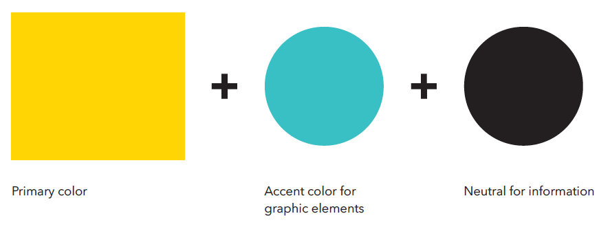
The official colors of Michigan Tech are black and yellow. These should be the dominant colors used on any University marketing materials.
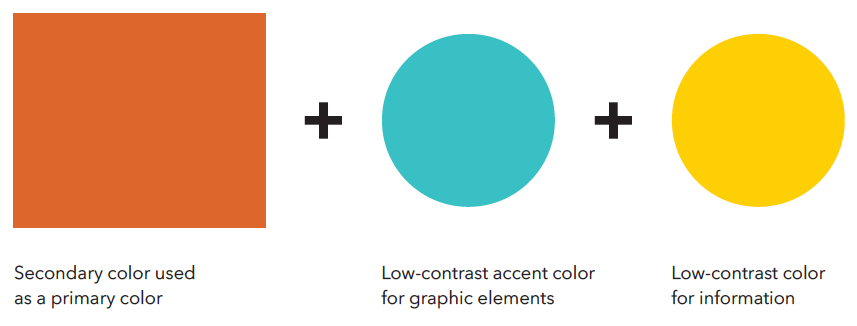
The secondary color palette can be used as accent colors when working on publications. These colors ensure University publications share a cohesive and unified theme.
Primary Colors

Gold
PMS 116
CMYK: 0/18/100/0
RGB: 255/206/0
HEX: #ffcd00

Black
Rick Black
CMYK: 0/0/0/100
RGB: 0/0/0
HEX: #000000

Dark Grey
CMYK: 67/59/58/42
RGB: 70/71/71
HEX: #454646
White
Paper White
CMYK: 0/0/0/0
RGB: 0/0/0
HEX: #ffffff
Secondary Colors

Deep Gold
PMS 7549 C
CMYK: 0/36/100/0
RGB: 251/173/24
HEX: #fbad18

Oxidized Copper
PMS 310 C
CMYK: 66/0/26/0
RGB: 62/192/197
HEX: #3ec0c5

Polished Copper
PMS 717 C
CMYK: 0/70/90/10
RGB: 220/102/45
HEX: #dc662d

October Sky
PMS 423
CMYK: 48/39/39/4
RGB: 138/140/140
HEX: #8a8c8c
Brand Color Tints
Tints from our secondary colors may be used as supporting background and accent colors. These tints should never be used as the primary color on marketing materials or on the web. Approved tints for each of our secondary colors are:
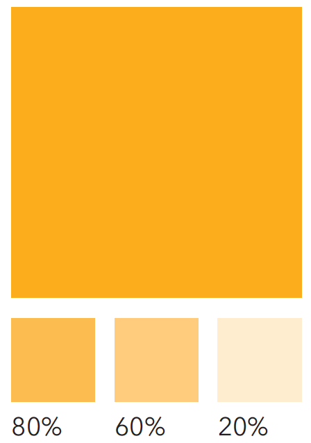
Deep Gold
80% | 60% | 20%
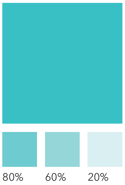
Oxidized Copper
80% | 60% | 20%
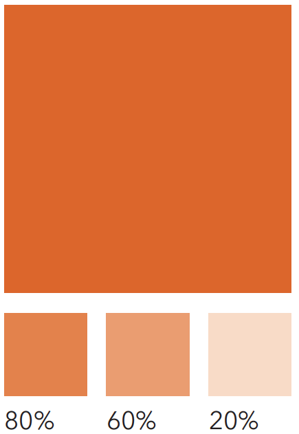
Polished Copper
80% | 60% | 20%
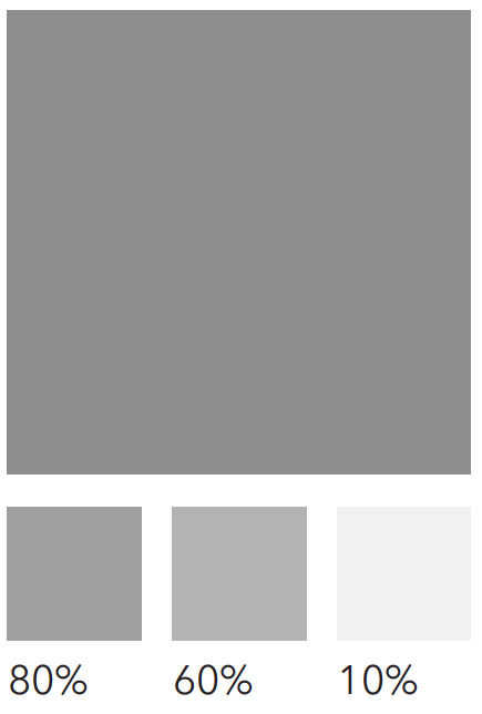
October Sky
80% | 60% | 10%
Construction Colors
As Michigan Tech expands and enhances campus spaces, it's important that even our physical materials align with our visual identity.
These brand-approved finishes ensure consistency across built environments and will be updated as new specifications emerge. If your project requires a color-matching solution for signage, cladding, or other construction materials, please contact University Marketing and Communications before finalizing materials.

Coil Coating
433C3477
Fluropon Special 1021 Yellow
Carlisle Architectural Metals
Basecoat: 431B153

Prismatic Powders
RAL 1032
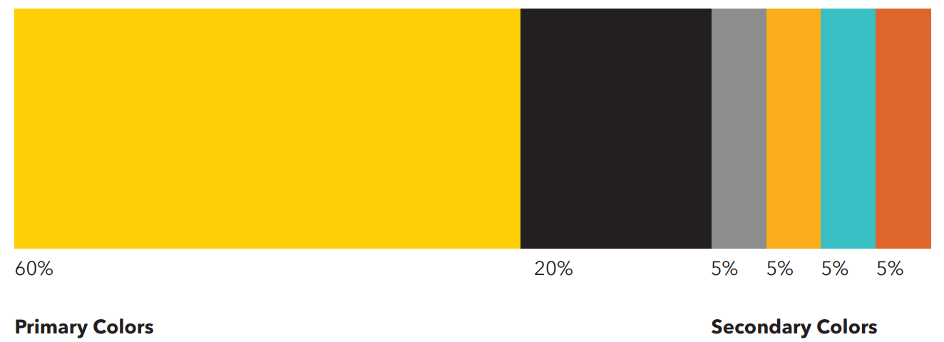
Color Proportions
Colors are organized here by size. The larger the percentage, the more prominence the color should have. Yellow should always be the prominent color used, with the remaining secondary colors being used as support.
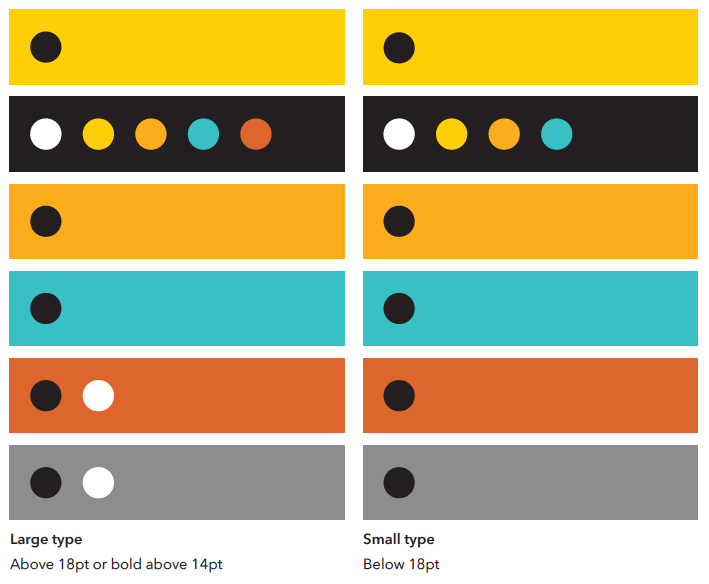
Color Accessibility
Always be sure there is sufficient contrast between colors and type. For black and white type, use the following combinations as a guide.
For additional information on accessibility standards for print and digital assets, please contact umc@mtu.edu.
Accessible Combinations
| Background Color | Large Type Above 18pt or bold above 14pt |
Small Type Below 18pt |
|---|---|---|
| MTU Yellow | MTU Black | MTU Black |
| MTU Black |
|
|
| Deep Gold | MTU Black | MTU Black |
| Oxidized Copper | MTU Black | MTU Black |
| Polished Copper |
|
MTU Black |
| October Sky |
|
MTU Black |
Color Pairing Do's
When selecting colors, it's important to consider their relationship. Primary and secondary colors can both be used together, but always consider legibility when doing so.
 Colors combined in composition.
Color Pairing Don'ts
Even though our primary and secondary colors are designed to be complementary, certain combinations should not be used due to poor contrast.

Information and elements are illegible in composition.
Typography
Typography for Print
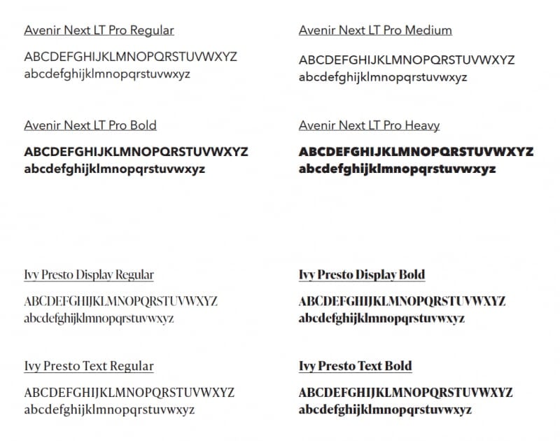
Michigan Technological University uses Avenir Next LT Pro as our primary print font. It can be used in a variety of font weights for body copy, subheads, callouts, and headlines. The primary type treatments for Avenir Next LT Pro are Title Case and Sentence Case, with Uppercase used as a secondary type treatment when needed.
Avenir Next LT Pro Condensed should never be used in place of Avenir Next LT Pro.
Our secondary print font is Ivy Presto, which should only be used in publications as a headline, callout, or tout. The secondary font should never be used for body copy. The primary type treatment for Ivy Presto is Title Case.
Typography for Web
We use Open Sans as our primary digital font. It can be used in a variety of font weights for body copy, subheads, callouts, and headlines. The primary type treatment for Open Sans is Title Case, with Sentence Case used as a secondary type treatment for body copy and subheads.
Our secondary digital font is Georgia, which should only be used as a quote or callout. The secondary font should never be used for body copy. The primary type treatment for Georgia is Title Case, with Sentence Case used as a secondary type treatment.
Graphic Elements
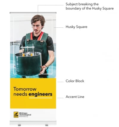
Husky Square
The Husky Square, pulled from our logo, is a key element in Michigan Tech's brand identity. The square embraces and celebrates uniqueness. This versatile element is designed to highlight our people, research, and innovation, placing them at the forefront of our brand. The Husky Square can adapt in size to fit project needs and can be used dynamically with imagery that breaks its boundaries, creating a bold and engaging visual effect. This approach ensures that our stories are centered around our community.
Color Blocks
Color Blocks are used to house content in a clean and digestible manner, and keep the focus on our photography and people. The primary colors for Color Blocks are MTU Yellow, Black, and White. Secondary colors and their tints may be used as accents but should not be used as the primary color.
Accent Lines
Accent Lines are used to draw attention to important text elements and to divide content neatly. These lines should always be solid and maintain a standard thickness of 3pt, with the ability to adjust based on project size.
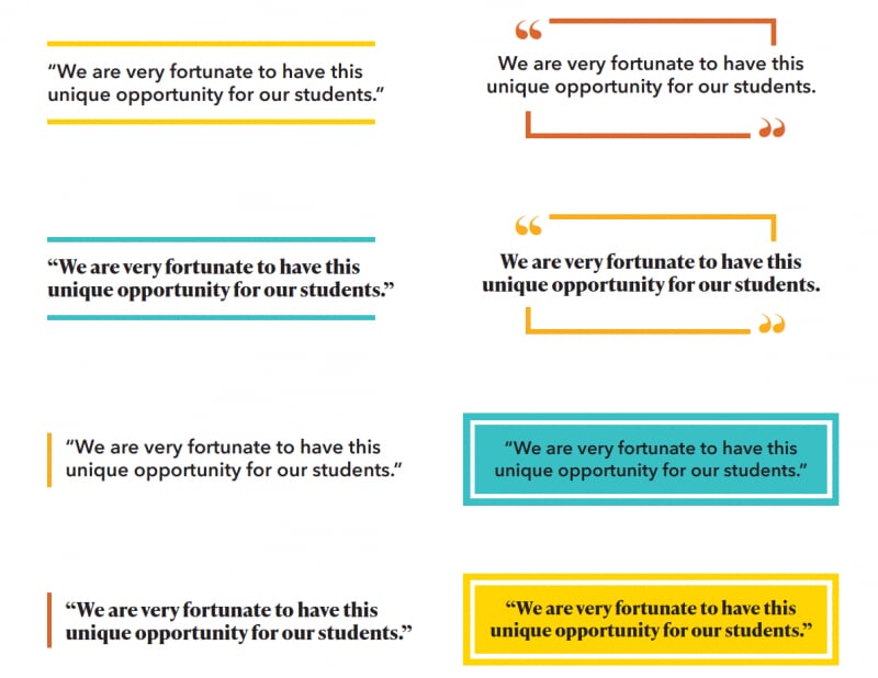
Type Callouts
Type callouts are used in our marketing materials and publications to draw attention to quotes and important information. Both Avenir Next LT Pro and Ivy Presto fonts can be used for type callouts.
Secondary colors may be used as an accent color when adding callouts to a design.
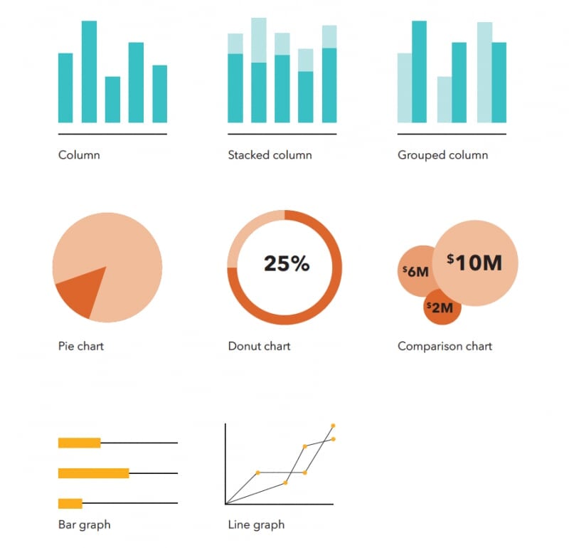
Infographics
Information graphics are crucial in showcasing detailed content. Whether we are highlighting donations, research, or enrollment, various styles of infographics can be used to easily communicate information.
We can use both our primary colors, secondary colors, and tints when creating infographics.
Avenir Next LT Pro should be used when creating infographics. This font allows important information to be communicated clearly.
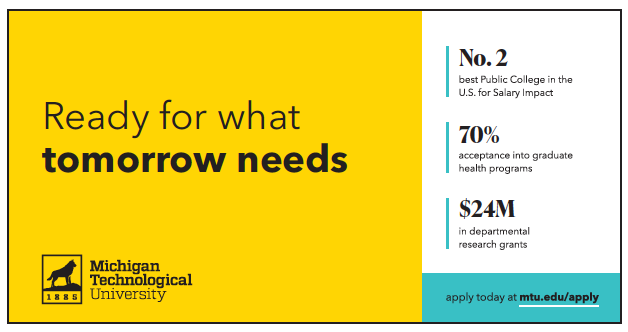
Touts
We use touts to highlight important achievements from our University. You can use both our primary colors and secondary colors when designing touts. We have a range of tout design options available to meet a variety of print and web needs.
Avenir Next LT Pro and Ivy Presto fonts should be used for touts on printed materials. Open Sans should be used for touts on the web.
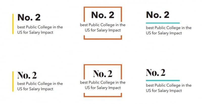
*Our boxed-in tout design should only be used with stand-alone touts in publications. Please do not use this layout when you are featuring multiple touts in a design.
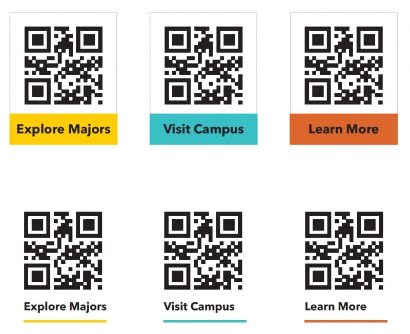
QR Codes
QR codes are a vital tool for guiding prospective students to important information. They are used on marketing materials and must remain black and white for optimal scanning. Any of our brand colors can be used for the surrounding design elements, but the code itself should always remain black and white. QR codes should be at least 0.8 inch in size to ensure readability.
Learn more about creating QR codes.
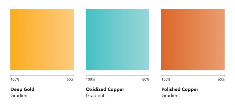
Gradients
Gradients can be used with our secondary colors to add dimension and visual interest. They should be used minimally as an accent design element.
Two different secondary colors should never be used together as a gradient.
Assets Created with AI
Assets and content generated by artificial intelligence can enhance our creativity and efficiency but should be used wisely. AI tools are appropriate for idea generation, streamlining workflows, and creating complementary design elements. However, final designs, content, photos, and brand identity elements must always be created by our team to ensure quality and consistency.
Always review and refine AI-generated content to align with our brand standards, and be transparent about its use when collaborating with stakeholders. Adhering to these guidelines ensures we maintain the integrity and authenticity of Michigan Tech's brand while leveraging the benefits of AI.