Making sure your documents are accessible supports people with disabilities who may also use assistive technologies. It also makes the document more usable for everyone. In this tutorial, we'll review the most common accessibility issues that should be addressed when creating your documents.
The following examples are illustrated in Microsoft Word 2016, but the principles are universal. Most programs have equivalent tools to perform these features.
Document Headings
While sighted users can scan a page for large or bold text to identify headings, non-sighted users who rely on screen readers miss these visual cues. Adding section heading styles to your documents provides important semantic structure that screen readers can access. Don’t use text size or emphasis (bold, underline, italic) as the sole means of identifying a heading.
Assign headings based on their hierarchy in the document. The main title or description of the document should be assigned Heading 1. There should only be one Heading 1 element in your document. Sub-headings of equal importance should follow as Heading 2. These can be thought of as the main chapters of the document. Headings at level 3 would break off from a Heading 2 element. Any further sub-headings should continue this pattern (Heading 4, etc.). Never skip a heading level (e.g., don’t go directly from a Heading 1 to a Heading 3).
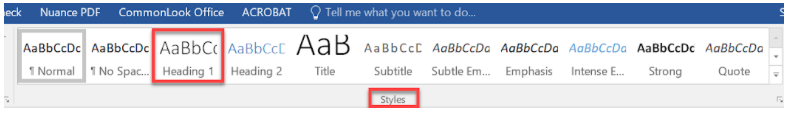
To add a heading style:
- Select the heading text in the document.
- Click the appropriate heading level from the styles area of the Home ribbon
Bonus: Once you have added heading styles, Word can easily build an accurate table of contents for the document.
Alternative Text (Alt text) on images
Blind or low vision users obtain information provided from images by listening to text-based descriptions called alternative text or alt-text. All images that contain important information should include alt-text. The alt-text should be as concise as possible (up to 150 characters) and describe the content and function of the image. Guidance on what makes effective alt-text varies, but one helpful approach is to imagine describing the image to someone on the phone.
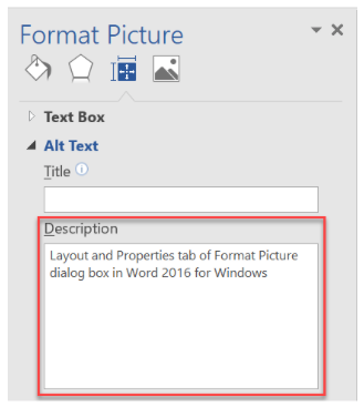
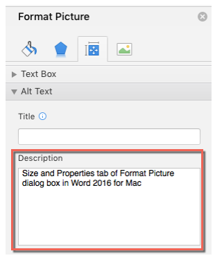
To add alternative text:
- Right-click on image and choose Format Picture.
- Select the Layout and Properties tab (Size and Properties on Mac) and enter alternative text in the Description field, NOT the Title field.
Descriptive Hyperlinks
If fully-formed hyperlinks are used as display text, a user who relies on a screen reader or text to speech software can easily become confused as the hyperlink is read out one character at a time. A better option is to use natural language as display text instead of the full hyperlink. For example, instead of using the hyperlink https://www.mtu.edu/admissions, use more descriptive display text like Michigan Tech Undergraduate Admissions page. Both hyperlinks will take the reader to the same webpage, but the more descriptive link provides better context for all users.
To add a descriptive hyperlink:
- Enter the descriptive natural language link text in the document.
- Select the link text, right-click and choose Hyperlink.
- Enter the full hyperlink in the Address field.
- Click the ScreenTip button and enter the same descriptive link text from the document

If you expect users to print the document, including both the full hyperlink text and the descriptive link text may be appropriate.
Avoid generic link display text
Screen reader users can browse all links in a document to determine the content. To avoid confusion, don’t use generic link display text such as "click here" or "more info." When multiple links use the same link display text, a user has no way of differentiating between them.
Tables
Use tables to present information and not as a method of controlling the layout and alignment of information in your document. Use column and/or row headers to provide proper table structure for screen reader users to properly access the table information.
To create a table:
- From the Insert tab in Word click on the table icon and select the desired number of rows and columns.
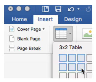
Table tool in Microsoft Word 2016 for Windows - To ensure accessibility click to select the column headers in the first row of the table.
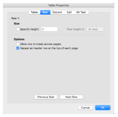
- Right-click and select Table Properties.
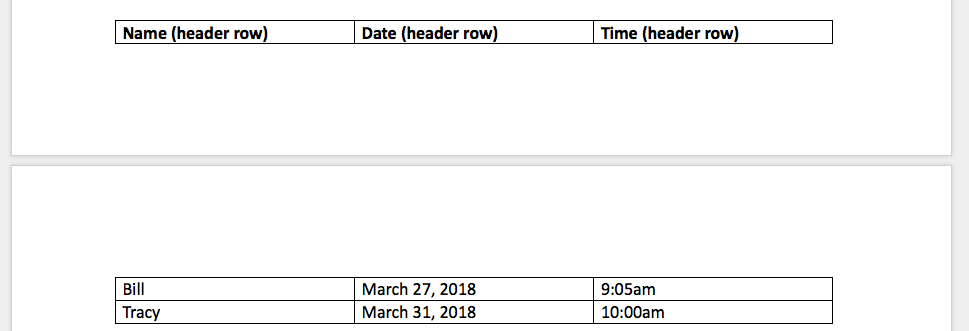
- From the Row tab in the Table Properties dialog check the box to "repeat as header row at the top of each page." Also make sure the option to "Allow row to break across pages" is not checked. Choose the Alt Text tab in the Table Properties and add an alt-text description.
If the table has proper structure you should be able to navigate through using only the tab button on your keyboard. Avoid the use of split cells and merged cells in tables. These can create accessibility problems for screen reader users.
Lists
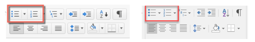
Use the list creation tool in the Home tab of the Word ribbon to create numbered or bulleted lists in your documents. This is the only way to create lists that are accessible. Using the tab key to create indented rows with dashes or numbers may create the visual appearance of a list, but it will not be accessible.
To create a list (option 1):
- Click the bulleted or numbered list button from the Home tab of the ribbon.
- Begin typing list items.
- Click list button again to close the list tool.
Multiple Columns
Use of the tab key or spacebar can create the appearance of columns in a document. However, this approach can create problems with the reading order of content accessed by a screen reader. Use the Columns tool in the Layout tab of the ribbon to create accessible columns.
To create multiple columns:
- Select all text that needs multiple column formatting.
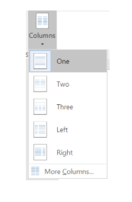
- Click the Columns tool in the Layout tab of the ribbon.
- Select the number of columns and any other alignment options desired from the More Columns option.
Color Contrast
To support people with low vision or color blindness, pay attention to the contrast ratio between text and the document background. Aim for a contrast ratio of at least 4.5:1.
- A very good contrast ratio (foreground text=black, background=white, ratio=21:1
- A satisfactory contrast ratio (foreground text=#6C6C83, background=white, ratio=5.1:1
- A failing contrast ratio (foreground text=#A6A6A6, background=white, ratio=2.4:1
The Colour Contrast Analyser is a free utility for checking the contrast ratios of text and other elements in your Word documents.
Color as Context
Never rely exclusively on color to provide information, make a comparison, or to illicit a response. Blind or color blind users will likely not be able to use this information. Although color can be used in your documents you should also use text-based methods to convey information, instead of relying solely on color.
Bad color example
Items below in red are vegetables:
- Banana
- Celery
- Pumpkin
- Strawberry
- Corn
Good color example
Items below in red are vegetables:
- Banana
- Celery (vegetable)
- Pumpkin
- Strawberry
- Corn (vegetable)
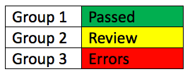
The table below demonstrates effective use of color and text to convey meaning. The color coding supports sighted users while the text descriptions support non-sighted or color blind users (green= "passed", yellow= "review", red= "errors").
Using the Accessibility Checker
To identify accessibility barriers in your documents Word has a built-in Accessibility Checker. To access the checker:
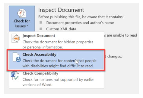
Word 2016 for Windows
- With your document open select the File tab.
- Click Check for Issues>Check Accessibility.
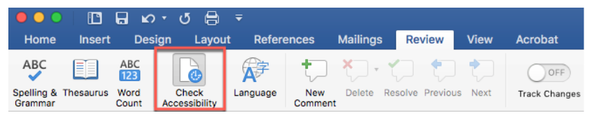
Word 2016 for Mac OS
- With your document open select the Review tab
- Click Check Accessibility from the ribbon.
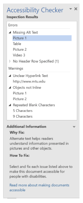
The Accessibility Checker will open in a panel to the right of your document with results. When you choose an item in the Inspection Results panel the item is selected in the document. At the bottom of the results panel Word provides information on why and how to fix each issue.
The Accessibility Checker identifies three categories of issues; Errors, Warnings and Tips. Errors are the most serious issues and should always be fixed. They contain content that cannot be read by screen-reader users and others with disabilities. Warnings, though less serious than errors, can also pose problems for some people reading the document. Tips are potential problems that Word identifies to help you better optimize the document’s readability and usability for everyone.
Exporting to PDF?
If you are planning on using your word document to create a PDF file, you'll want to make sure that you use "Export to PDF" or "Save As PDF," and in the dialog box, be sure that "Best for electronic distribution and accessibility" is selected. This will ensure that all of the accessibility efforts you have made in word are carried over into the PDF. Be sure not to use "Print to PDF" as this will strip out all of the accessibility features.
Resources
Microsoft Word Accessibility video training
WebAIM: Microsoft Word 2016 training resources
Web Accessibility Initiative (WAI) Headings Tutorial
National Center on Disability and Access to Education (NCDAE) Cheatsheets: