Making sure a document is accessible supports people who use assistive technologies. It also makes the document more usable for everyone. This tutorial reviews the most common accessibility issues that should be addressed when creating documents.
Creating accessible documents requires the author to establish the important structural elements that are important for users of assistive technology and others. The creation workflow varies based on the software you are using, such as Microsoft Word, Google Docs, or Adobe InDesign (Adobe resource).
Document Headings
While sighted users can scan a page for large or bold text to identify headings, non-sighted users who rely on screen readers miss these visual cues. Adding section heading styles to your documents provides important semantic structure that screen readers can access. Don’t use text size or emphasis (bold, underline, italic) as the sole means of identifying a heading.
Assign headings based on their hierarchy in the document. The main title or description of the document should be assigned Heading 1. There should only be one Heading 1 element in your document. Sub-headings of equal importance should follow as Heading 2. These can be thought of as the main chapters of the document. Headings at level 3 would break off from a Heading 2 element. Any further sub-headings should continue this pattern (Heading 4, etc.). Never skip a heading level (e.g., don’t go directly from a Heading 1 to a Heading 3).
Alternative Text (Alt text) on images
Blind or low vision users obtain information provided from images by listening to text-based descriptions called alternative text or alt-text. All images that contain important information should include alt-text. The alt-text should be as concise as possible (up to 150 characters) and describe the content and function of the image. Guidance on what makes effective alt-text varies, but one helpful approach is to imagine describing the image to someone on the phone.
Descriptive Hyperlinks
If fully-formed hyperlinks are used as display text, a user who relies on a screen reader or text to speech software can easily become confused as the hyperlink is read out one character at a time. A better option is to use natural language as display text instead of the full hyperlink. For example, instead of using the hyperlink https://www.mtu.edu/admissions, use more descriptive display text like Michigan Tech Undergraduate Admissions page. Both hyperlinks will take the reader to the same webpage, but the more descriptive link provides better context for all users.
If you expect users to print the document, including both the full hyperlink text and the descriptive link text may be appropriate.
Avoid generic link display text
Screen reader users can browse all links in a document to determine the content. To avoid confusion, don’t use generic link display text such as "click here" or "more info." When multiple links use the same link display text, a user has no way of differentiating between them.
Tables
Use tables to present information and not as a method of controlling the layout and alignment of information in your document. Use column and/or row headers to provide proper table structure for screen reader users to properly access the table information.
Lists
Use the built-in icons or tools to create numbered or bulleted lists in your documents. This is the only way to create lists that are accessible. Using the tab key to create indented rows with dashes or numbers may create the visual appearance of a list, but it will not be accessible.
Multiple Columns
Use of the tab key or spacebar can create the appearance of columns in a document. However, this approach can create problems with the reading order of content accessed by a screen reader. Use the built-in icons or tools for columns to create accessible columns.
Color Contrast
To support people with low vision or color blindness, pay attention to the contrast ratio between text and the document background. Aim for a contrast ratio of at least 4.5:1.
- A very good contrast ratio (foreground text=black, background=white, ratio=21:1)
- A satisfactory contrast ratio (foreground text=#6C6C83, background=white, ratio=5.1:1)
- A failing contrast ratio (foreground text=#A6A6A6, background=white, ratio=2.4:1)
The Colour Contrast Analyser is a free utility for checking the contrast ratios of text and other elements in your Word documents.
Color as Context
Never rely exclusively on color to provide information, make a comparison, or to illicit a response. Blind or color blind users will likely not be able to use this information. Although color can be used in your documents you should also use text-based methods to convey information, instead of relying solely on color.
Bad color example
Items below in red are vegetables:
- Banana
- Celery
- Pumpkin
- Strawberry
- Corn
Good color example
Items below in red are vegetables:
- Banana
- Celery (vegetable)
- Pumpkin
- Strawberry
- Corn (vegetable)
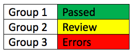
The table below demonstrates effective use of color and text to convey meaning. The color coding supports sighted users while the text descriptions support non-sighted or color blind users (green= "passed", yellow= "review", red= "errors").
Using the Accessibility Checker
To identify accessibility barriers in your documents, use the built-in accessibility checking tool within the software you are using.