Messaging
Visual Identity
Messaging
Who We Are
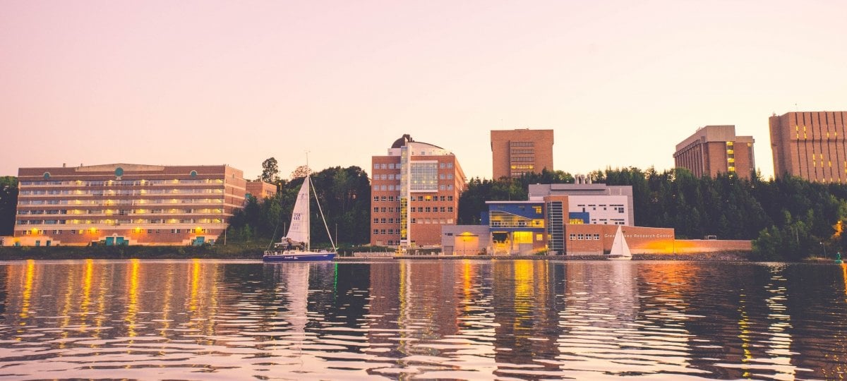
Michigan Technological University is a public research university, home to more than 7,000 students from 54 countries. Founded in 1885, the University offers more than 120 undergraduate and graduate degree programs in science and technology, engineering, forestry, business and economics, health professions, humanities, mathematics, and social sciences. Our campus in Michigan's Upper Peninsula overlooks the Keweenaw Waterway and is just a few miles from Lake Superior.
The Place to Be (Real).

Platform
Michigan Tech's brand platform inspires external messaging that is uniquely ours: real.
More than a logo or tagline, our brand platform establishes the brand and is the foundation from which all marketing decisions are made. If a message falls outside our brand promises—real people, opportunities, and experiences—we argue it's a story probably not worth telling.
Promise to Make it Real
Real people
faculty, students, alumni, friends, prospective students, you
Real opportunities
facilities, location, traditions, research, events, classes, weather
Real experiences
in class, in the field, internships, co-ops, abroad
Attributes
Brand attributes are characteristics that speak to the personality of the brand.
- Smart
- Hardworking
- Unpretentious
- Relentless in the pursuit of better

Differentiators
Differentiators are a set of enduring features separating Michigan Tech from competitors.
We celebrate tough:
- Research
- Location
- Traditions
- Events
- Snow
- Water
- People
Stories
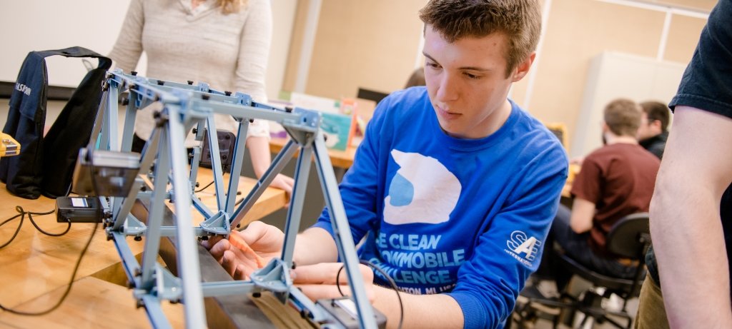
It's easy to rely on data to tell our brand story (salaries, placement, expenditures). We want to focus on the journey—not just outcomes: Demonstrate what life is like for a first-year engineering major. Showcase a day-in-the-life of a researcher. Or talk about what it's like to be president of a student organization.
We want STEM to not only be seen as necessary and important for our world, but also as just plain cool.
Share stories that are:
- Compelling
- Current
- BIte-sized
- Relatable
More than Features and Benefits
A feature is a factual statement about a product or service. A benefit answers "What's in it for me?" Our external messaging doesn't center on features and benefits, but rather real, emotive brand stories. Narratives about students, alumni, and research get to the heart of why our audiences care about Michigan Tech, and what they'll come to believe about our brand through storytelling.
Tone of Voice
Honest.
It's how we say what we say—and it's essential that all external communications consistently share our trademark tone of voice.

Honest Means . . .
Down to Earth. Straightforward. Confident. A Little Quirky.
Use simple, active, staccato sentences. Avoid jargon and fussy words.

Power Statements
Memorable phrases that can be infused in messaging as headlines, subject lines, cutlines, social media, body copy, and more.
- Location—Bound together by distance, STEM, and snow.
- Second Family—We're a pack—in it together.
- Research—Roll up our sleeves to analyze, dig, compare, and deploy.
- Value—Michigan Tech grads get jobs.

Frequently Used Words
Simple, active words and verbs create a sense of liveliness and urgency.
- Analyze
- Build
- Choose
- Collect
- Connect
- Create
- Do
- Engineer
- Explore
- Find
- Fuse
- Grind
- Grit
- Haul
- Innovate
- Lead
- Load
- Measure
- Pack
- Research
- Smart
- Submerge
- Tenacity
- Work
Visual Identity
Logo System
Full Name
Full-Name Horizontal

Full-Name Wordmark Stacked

Full-Name Wordmark
![]()
When to Use
Use our stacked horizontal or full-name mark to provide immediate identity recognition in scenarios where the University brand is unfamiliar.
University Logos are Trademarked
All Michigan Tech logos downloaded from this page are registered trademarks of Michigan Technological University. The use of the Michigan Tech name, logos, seals, and/or other symbols of the University, in commercial venture, even fundraising or promotional activities, requires prior written approval. Only licensed vendors are authorized to produce merchandise and apparel featuring the University name and/or logos. For more information and a list of licensed vendors, please visit our trademark licensing page.
Michigan Tech
Michigan Tech Vertical
Michigan Tech Horizontal

Michigan Tech Wordmark
When to Use
Use these marks only when the full University name is included elsewhere.
Husky Icon
![]()
When to Use
Use this mark only when the name of the University is present elsewhere. On campus, this mark may stand alone when used in conjunction with signage, events, and internal communication.
Clear Space

Maintain .25 inches of clear space around logo.
Clear space is the protected area around the logo that maximizes its impact. This space must be kept free of all other graphics and text, including other logos.
Minimum-Size Restrictions
Minimum-size requirements ensure legibility of the logo. Contact University Marketing and Communications with questions or concerns regarding logo size.
The full-name horizontal logos should never be smaller than .5 inches tall.

The Michigan Tech wordmark should never be smaller than 1.5 inches wide.

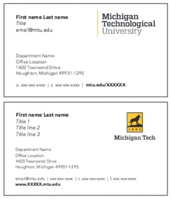
Business Cards
Reverse side (three color options or blank)
Letterhead
Department Letterhead
To place an order, contact umc@mtu.edu.
Digital Letterhead
Download digital department letterhead. Digital letterhead is not intended for print.
Minimum-Size Restrictions
Minimum-size requirements ensure legibility of the logo. Contact University Marketing and Communications with questions or concerns regarding logo size.

Unacceptable Applications
Do not re-create the Michigan Tech logo, change the logo's color, stretch the type, alter, move elements of the logo, or add or subtract design elements.
Use only official logos prepared by and available from University Marketing and Communications.

Do not stretch the logo vertically.

Do not condense the logo horizontally.

Do not make the logo transparent.

Do not move elements of the logo.

Do not change the one color logo to any other color.

Do not use another color within the logo.

Do not use a web logo on a print publication.

Do not tilt or position the logo vertically.

Do not mix the one color logo options.
How to Use the Logo
Color Variations
These are approved logo variations when applied on color backgrounds.

White logo on a dark color background

Black logo on a light color background

Full-color logo on white

Black logo on white

Black logo on gold

Gold on black

White on black
Photography
The following are recommendations of logo use on photographs. The designer should use their best judgment when overlaying the logo. Never place logo over people, complex images, patterns, or main focal points in the photograph.

Use full-color logo on a light photo.
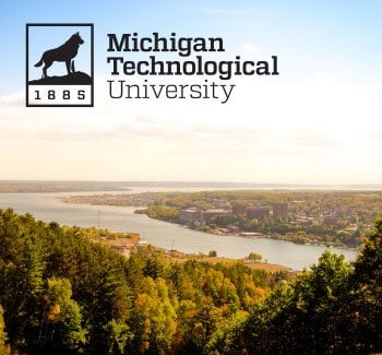
Black logo may also be used on a light photo.
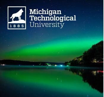
Use white (or gold) logo on a dark photo.
University Seal
When to Use
The University seal is used for formal and official documents, such as diplomas and communications from the president. It is not for general use. The seal may not be used on apparel. The seal may not be altered in any way or blended with other designs or symbols.
The seal may be used on pre-approved specialty items.
Color Palette
Primary Palette
The official colors of Michigan Tech are black and gold.

PMS 116
CMYK: 0/18/100/0
RGB: 255/206/0
HEX: #ffcd00

Black
CMYK: 0/0/0/100
RGB: 0/0/0
HEX: #000000
Secondary Palette
The secondary color palette provides additional options when working on publications. These colors ensure University publications share a cohesive and unified theme.

PMS 7549 C
CMYK: 0/36/100/0
RGB: 251/173/24
HEX: #fbad18

PMS 423
CMYK: 48/39/39/4
RGB: 138/140/140
HEX: #8a8c8c

PMS 310 C
CMYK: 66/0/26/0
RGB: 62/192/197
HEX: #3ec0c5

PMS 717 C
CMYK: 0/70/90/10
RGB: 220/102/45
HEX: #dc662d
Typography
Primary Font Family
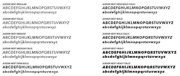
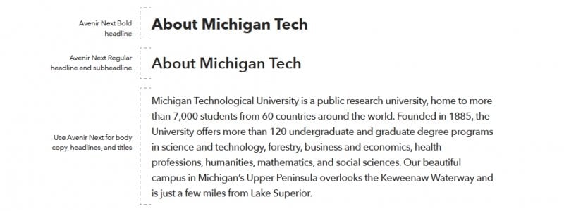
Avenir Next—Our sans-serif typeface for body copy and headlines.
Secondary Print and Web Font
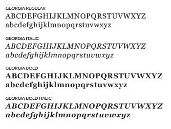
Georgia—Serif typeface, use for print headlines, call outs, and display copy and for long web blockquotes.
Primary Web Font
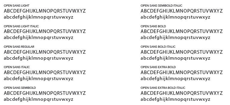
Open Sans—Our sans-serif typeface, primary web font used for body copy and headings.
Typography for Print
Sample Paragraph
Sample Paragraph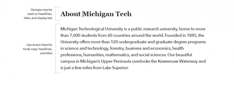
Department Identifiers
Horizontal and Vertical Variations
While the University logo system is available to all Michigan Tech colleges, schools, and departments, unique identifiers are available. They include the department name with the University logo and name.
Vertical Identifier

Horizontal Identifier

Unacceptable Applications
Do not re-create the Michigan Tech identifiers, change the color, stretch the type, realign the text, move elements of the identifier, or add or subtract design elements.
Use only official logos prepared by and available from University Marketing and Communications.

Do not stretch the logo vertically or horizontally.

Do not center align or reformat the text in any way.

Do not move elements of the logo.

Do not change the logo to any other color.

Photography
What makes a Michigan Tech photo?
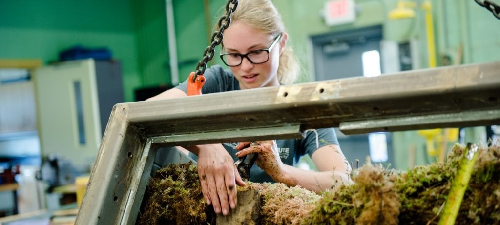
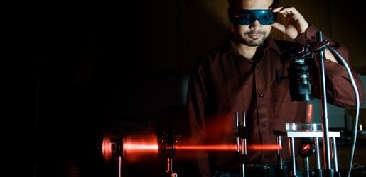
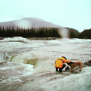
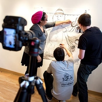
- Our shots are not staged; they are honest examples of who our students, faculty, and alumni are and what they do.
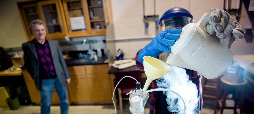
- Our photos show students and faculty doing real work—in the lab, in the field, on campus, and abroad. We work hard and play hard in all types of environments.
- We avoid unnatural filters, gels, and lights.
- We capture images from eye level—our subjects are not always smiling at the camera.
Photos should highlight our:
- Natural environment
- Extreme adventure
- Extreme conditions
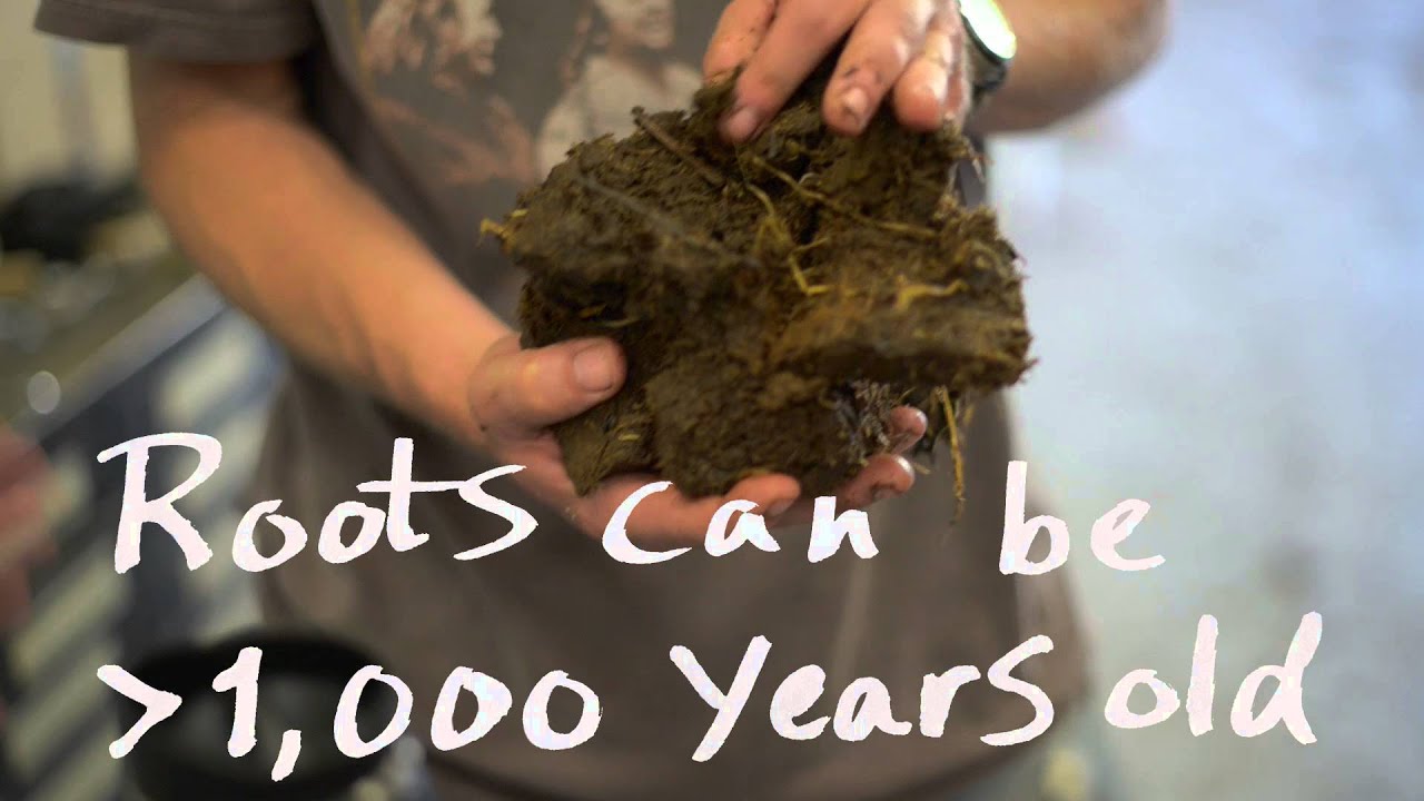
Peat Harvest

Michigan Tech's Campus
Videography
What makes a Michigan Tech video?
- Our videos are made on location. Wherever our faculty, students, and staff are, we go.
- Our campus is active, gritty, and adventurous. Our lens doesn't live on a tripod, it follows the action.
- We film with natural light whenever possible.
- Students, faculty, and alumni use their own words—to the point and with conviction.
Videos should highlight our:
- Culture, campus, and beautiful spot on the map
- Passion for the subject at hand, from both sides of the lens
- Secure identity—we are not everything to everyone
Resources
Contact Information
Ian Repp
Associate Vice President for University Marketing and Communications
- irepp@mtu.edu
- 906-487-2354
- Administration Building G26
