Michigan Tech is committed to making our digital communications accessible to everyone. These guidelines aim to help MTU social media admins (SMAs) ensure their content is in compliance with accessibility standards.
Why Social Media Accessibility Matters
Following the Americans with Disabilities Act (ADA) and the Web Content Accessibility Guidelines (WCAG) ensures we meet legal requirements. It broadens the reach of our content and ensures all audiences can engage fully.
Alt Text for Images
What is Alt Text?
Alt text is a shorter way of saying alternative text, which is a written description of an image for people using screen readers. It should be concise yet descriptive enough to convey the key information.
Best Practices for Alt Text
- Be concise but informative (125 characters or fewer).
- Describe the image’s content and context.
- Avoid saying "image of" or "picture of."
Example for Best Practices for Alt Text
Instead of "Image of students on campus," use "Students walking in front of Michigan Tech’s Husky Statue."
Images with Text or Graphic Elements
If the image contains text or important graphic elements, that content should be included in the alt text.
Text in Images
If the image includes essential text (e.g., quotes, event details), provide the full text in the alt description.
Example
For a promotional image with text that says, “Join us for Winter Carnival, February 8-10,” use alt text like: “Join us for Winter Carnival, February 8-10, with ice sculptures and winter sports.”
How to Add Alt Text on Social Media
Many social media platforms now allow their content creators to add alternative text to the images they post:
- Facebook photo alternative text
- Instagram photo alternative text
- X photo alternative text
- LinkedIn photo alternative text
Complex Graphics or Charts
Provide a concise summary of the key information or findings, especially for charts or diagrams.
Example
For a pie chart showing departmental funding distribution, alt text could be: “Pie chart showing 40 percent funding to research, 30 percent to education, 20 percent to outreach, and 10 percent to administration.”
In cases where the image is too complex to describe succinctly in alt text, include a brief alt text description and provide a link to a more detailed description.
Closed Captions for Videos
Why Use Captions?
Captions make video content accessible to people with hearing impairments and those who prefer to consume content without sound.
Best Practices for Captions
- Always provide accurate captions, not just automatic ones.
- Include all spoken dialogue and relevant sounds (e.g., [laughter], [applause]).
- Use punctuation and capitalization for readability.
Videos with No Audio or Minimal Audio
For videos without audio or with minimal audio (such as background music), a descriptive transcript is required to ensure accessibility. According to WCAG guidelines, this type of content is referred to as "video-only." The transcript should describe any visual elements or text that appear in the video but are not conveyed through audio. This is particularly important if the video contains text that is not read aloud.
For more details, refer to the WCAG guidelines on video-only content.
How to Add or Upload Captions to Social Media
If you plan to upload your video to YouTube, you can use their built-in subtitle and closed captions editor. You can also use a third-party captioning service like 3PlayMedia or Rev.
Once your video is captioned, the SRT caption file can be uploaded to most social media platforms—along with a video file:
- Facebook video captions
- X video captions (Only available in a computer browser)
- YouTube video captions
- Vimeo video captions (Paid accounts have access to automated subtitle transcription)
- LinkedIn video captions
- Instagram video captions (Only available on Android, iPad, and iPhone)
- Snapchat video captions
Use of Hashtags
Why Hashtag Accessibility Matters
Screen readers read hashtags without spaces, making them difficult to understand if not formatted correctly.
Best Practices for Hashtags
Capitalize the first letter of each word (Camel Case) for readability.
Example
#MichiganTechHuskies, not #michigantechhuskies.
Limit the number of hashtags to avoid clutter.
Descriptive Links and URLs
What Makes a Link Accessible?
Links should give users an idea of where they will be directed. Avoid generic phrases like "click here."
Best Practices for Links
- Use descriptive language for hyperlinks.
- Example: instead of "Click here to read more," use "More about Tech's Research."
- Shorten long URLs, and include meaningful context.
Avoid Text on Images (If Possible)
Why It’s Important
Text embedded in images is not readable by screen readers, and it can be challenging for those with visual impairments.
Best Practices
- Use text overlays instead of embedding text in images.
- If text must be part of an image, provide the same text in the post's description or alt text (for clarification, see the Alt Text for Images section).
Color Contrast and Readability
Why Contrast Matters
Color contrast impacts readability for individuals with visual impairments, including color blindness. For additional information on accessibility standards for print and digital assets, please contact UMC by emailing umc@mtu.edu.
Best Practices for Contrast
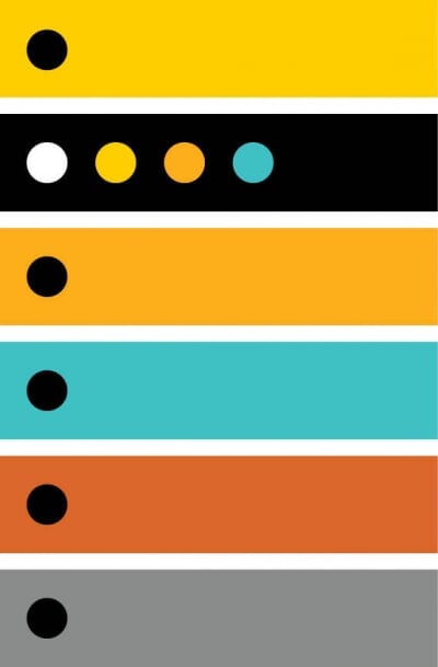
- Ensure high contrast between text and background colors (e.g., dark text on a light background).
- Always be sure there is sufficient contrast between colors and type. For black and white type, use the following combinations below as a guide.
- Avoid relying on color alone to convey meaning (e.g., don’t use red to indicate importance without additional indicators).
- When in doubt regarding proper color contrast, reach out to UMC or utilize a free color contrast analyzing tool.
Recommended Free Color Contrast Analyzing Tools
Primary Brand Color Palette
See Michigan Tech’s Full Style Guide for more information about our brand.
The official colors of Michigan Tech are black and gold.

PMS 116
CMYK: 0/18/100/0
RGB: 255/206/0
HEX: #ffcd00

Black
CMYK: 0/0/0/100
RGB: 0/0/0
HEX: #000000
Secondary Palette
The secondary color palette provides additional options when working on publications. These colors ensure University publications share a cohesive and unified theme.

PMS 7549 C
CMYK: 0/36/100/0
RGB: 251/173/24
HEX: #fbad18

PMS 423
CMYK: 48/39/39/4
RGB: 138/140/140
HEX: #8a8c8c

PMS 310 C
CMYK: 66/0/26/0
RGB: 62/192/197
HEX: #3ec0c5

PMS 717 C
CMYK: 0/70/90/10
RGB: 220/102/45
HEX: #dc662d
Accessible Color Combinations
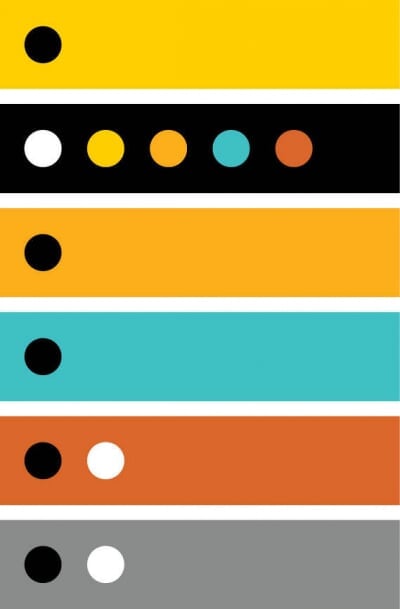
|
Background Color |
Text Color |
|---|---|
|
Yellow |
Black |
| Black |
|
| Orange | Black |
| Oxidized Copper | Black |
| Copper |
|
| Grey |
|
|
Background Color |
Text Color |
|---|---|
|
Yellow |
Black |
| Black |
|
| Orange | Black |
| Oxidized Copper | Black |
| Copper | Black |
| Grey | Black |
Plain Language
What is Plain Language?
Using simple, direct language makes your content easier for all users to understand, including those with cognitive disabilities.
Best Practices for Plain Language
- Use short sentences and common words.
- Avoid jargon, or define technical terms when necessary.
Use of Emojis
Why Be Cautious with Emojis?
Screen readers will read out the name of each emoji, which can disrupt the flow for those using screen readers or other assistive technology.
Best Practices for Emojis
- Use emojis sparingly.
- Place them at the end of sentences rather than midsentence.
- Avoid using strings of emojis that could be read aloud unnecessarily.
Emojis and Evolving Meanings with Screen Readers
Emojis often carry emotional or cultural meanings that can evolve over time, depending on how society uses them. This variability makes it challenging for screen readers to accurately convey the intended tone, especially if an emoji’s meaning shifts.

For instance, the nail polish emoji might be used to express relaxation, sassiness, or nonchalance depending on the context. However, a screen reader will simply read this emoji as “nail care” without interpreting its implied meaning.
Because emojis can hold multiple interpretations, especially across different generations or platforms (like Instagram), their meaning may not always be clear to all audiences. What might signal confidence or nonchalance in one group could be misunderstood by others, leading to confusion for screen reader users. It’s important to be mindful of how emojis are used and consider their evolving meanings to ensure your content is inclusive and clear for all users.
Emojipedia Unicode Descriptions
Emojipedia is the world's No. 1 emoji reference site, providing up-to-date and well-researched information. They are also a member of the Unicode Consortium. The UMC Social team often refers to Emojipedia’s emoji descriptions to learn more about emoji meaning and cultural context surrounding an emoji.
When you are unsure what the meaning of an emoji may be, err on the side of caution. Do you need to be posting that particular emoji? Is there another emoji that fits better in this situation?
Test Your Content for Accessibility
Why Testing is Important
Testing your content ensures it meets accessibility standards before publishing.
Tools for Testing Accessibility
WAVE (Web Accessibility Evaluation Tool)
Useful for testing contrast and alt text.
Screen Readers
Use built-in screen readers like VoiceOver (iOS) or TalkBack (Android) to review posts.
Social Media Platform Tools
Use built-in accessibility features (e.g., Facebook's Accessibility feature).
Continuous Learning and Improvement
Stay Updated
Accessibility standards are continually evolving, and Michigan Tech is committed to staying compliant and inclusive.
Resources for Continued Learning
Making social media content accessible is a shared responsibility. By following these best practices, Michigan Tech’s SMAs can help ensure all individuals have an equitable experience.
If you have questions regarding social media accessibility, please reach out to social@mtu.edu.